Wellness Dashboard
The Wellness Dashboard displays detailed statistics for key health indicator, such as heart rate, respiratory rate and heart rate variability.
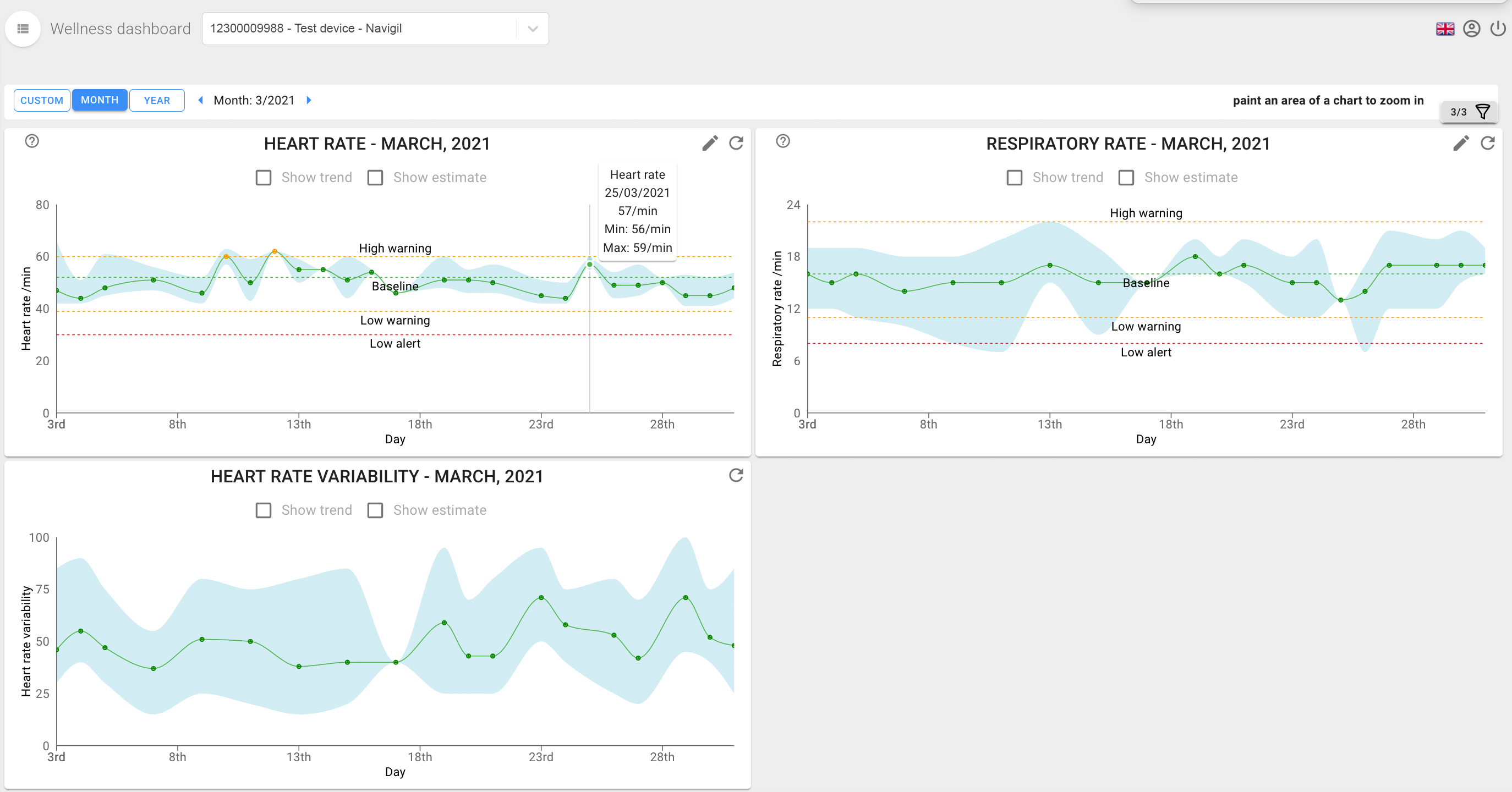
Each chart shows minimum, maximum and average values (green graph). The average calculation changes depending on the selected time range:
- If time range less than or equal to a month, then average is daily average.
- If time range is over one month, then average is weekly average.
Select the Show trend option on a graph to see the estimated trend line of the given health indicator. Select Show estimate to adjust the graph timeline and see the projected direction of the trend line.
Mouse over the graphs to get a popup with measurement details for the specific time.
In addition to the measured values, where relevant, graphs show a baseline value along with low warning and alert levels.
- Baseline: assitee's rest heart rate
- Low warning: value that triggers a warning
- Low alert: value that triggers an alert
Tip
The context menu (e.g. in Windows, right-click on a graph) gives you quick access to options for exporting the graph content.